

This set of posters support the different product areas that come within Selfridges. These posters support the shoes, the handbags and the hats within the Selfridges store. This is something that I could then consider adding to and creating one for the flowers. The use of the new type introduces the consumers to the area that they are approaching. This means that this stands out. The use of the illustrations allows this to stand out more so than the usual logo with their being more to this, this being colours, images, and type which means that they are pleasing and would allow the consumer to engage with this. This is something that I will look into as I am fond of these designs.

This is also another style that the brand have introduced and tried out. This create a collage for the brand and although the same colours are used this then allows the poster to stand out and catch the consumers attention. The blend in the images, illustration along with the type with the colours allows this to be of emphasis and aesthetically pleasing. This is an innovative style so this i something that I could again re-vamp and re-create in terms of design. However, this would not be successful or appropriate for the logo or strap line, this would be more suitable for the poster/flyer for the design/ new service.


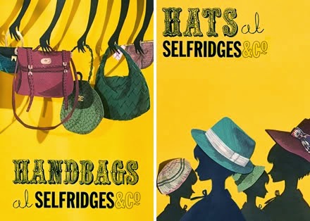
This is again another form of style that the brand of Selfridges have used over the years. This is again something new and creative for the brand and steers away from their usual simplistic style. By adding the use of different texts and making this more vibrant and intriguing this is where the consumers will be drawn to. The colour black and yellow are still represented which means that this can still link back to the brand but the use of illustration and different type breaks this up and draws in the audience. With this being so detailed this means that the consumer is drawn to the different areas and has to take this all in and allow the innovative and unique presentation of the poster to stand out. This again is successful for the brand however, in terms of a logo this is not appropriate. The reason why I am presenting this is to showcase how the brand does infact use different colours when something new or something big is happening. This would leave room for creativity in terms of my service for the brand. This could launch a new style similar to this. This is something I would have to consider.


The same applies to this, this is engaging and pleasing on the eye. This catches your attention because this is something that Selfridges do not do often so when they do it makes a big impact on the consumer and stand out. This implies that what is happening is important. This is what I want to show with my service showing how this is key and important. This is a style I will consider but not for a logo possibly for a poster or a flyer or even on a mail out.
No comments:
Post a Comment