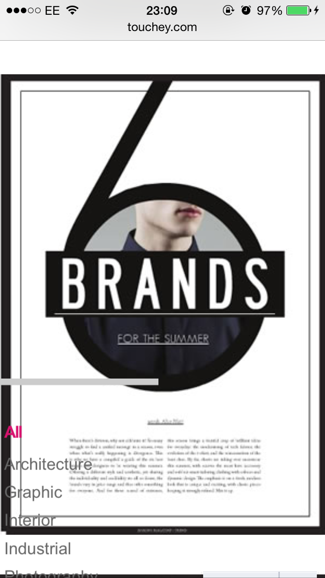
This layout inspiration was found when i was typing in creative layout ideas into google to aloo general styles to come up on the search. This was from a blog link, this stood out to me due to the colours used along with the creativity that has been placed within the design. To me, this seems like a sophisticated inspiration to copy and allow the Selfridges service to be promoted through this style. This is due to the level of sophistication that this holds. The key elements within this design are the colour used along with the different fonts, the boarders, the placements of images and the general feel that you get from the style. This is not something that Selfridges would usually go for however, with this service being completely new this left me more room to mess about and create a brand new style and image for the brand as far as this new service is involved. With this style and the connotations that this holds this allows the brand to come across in a friendly, unique and playful yet also exciting manner. additionally, this the style being new, this is innovative and creative. As a whole, this style is everything that the service will promote which allows this to become aesthetically pleasing and original which will allow the service to stant out. In terms of layout, this will be presented in a magazine format to allow the brand aesthetics and guides to still be present just with authority sporting that luxury lifestyle.
As i am happy that I have found the right style for the dissertation layouts, I can no behind carrying out with the design aspects and preparing for my first shoot.


No comments:
Post a Comment