Throughout this project it is extremely clear that I have tried to bring in a new colour to the flower service that Selfridges are going to be offering. The reasoning for this is to allow this to be identified as a new expansion and although this is they focus on the colour yellow this adds something that other retailers/brand are not used to. CHANGE.
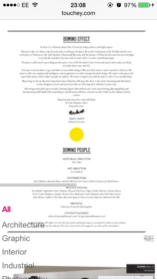
So, with regards to this, I want to lay out my portfolio in the same style that I did my dissertation, so this will showcase boarders, delicate and playful fonts, the colour pink used for block squares to indicate places of importance and also the use of lines and sophistication.
With the layout I want this to be as minimalistic as possible. I want this to showcase how the brand are channeling through all that they know and stand for within this new service. This will have hardly any text on to allow the attention to be around the designs in which I have created.
So my portfolio is going to be presented using this style which I will showcase at the end with all my forms of promotion.


No comments:
Post a Comment