Tuesday, 13 May 2014

Evaluation

With this project I have tried to maintain a wide scope view on the brand and the issue of flowers due to these both being out of my comfort zone with myself usually focusing on flowers. With this project I have thoroughly enjoyed creating this as it was something new and allowed myself to put my skills to good use in others forms. When creating this new service for Selfridges and focusing on the market of flowers I understood that I was taking a huge risk due to the brand success and their level of sophistication however, I hope I have managed to pull this off.

Within this campaign I tried to be as experimental as possible due to the brand reaching out to new consumers and basing themselves under a whole new limelight so new modern updates took place which is what allowed me to have so much fun with this project. Due to nothing being created like this before this meant I was able to start this from scratch and include exactly what I wanted to.

In terms of promotion an development in that sense this took a lot longer than I thought but what I was creating was really time consuming and needed a lot of care and attention which meant that I needed to slow myself down slightly.

With the outcomes I found that they are presented in a girly sense and although flowers are unisex their main attraction was from females so I chose to place the colour pink throughout which change the whole perspective and viewpoint on the brand making this pleasing, playful, fun yet still holding that level of sophistication that they do.

This allowed me to focus on my skills and progress as a person in general allowing me to grown in the knowledge of flowers. What I liked about this project was that it was so free and open to all forms of progression. This allowed me to go as minimalistic or as busy as I wanted and there was so much to play around with which meant that I enjoyed placing all the outcomes together.
What I like about the work in which I have produced is that it is through and I like the style that I have tried to imitate as I personally think this gives a new outlook on the brand. I enjoyed the photoshoot and the assistance of the graphic design Eunice for the stall as I found that this helped me in showcasing the exact image that I wanted to. Another element that I found that I enjoyed was the split timed deadlines as this allowed me to set myself goals and as these were met I felt a little closer to finishing and that feeling of satisfaction was visible.

On the other hand, the side of the project that I didn't really like was that I found that due to no other retailer trying this out before there was not alot of direction so I could have totally messed this up with going with my own instinct but like I have mentioned I am happy with the outcomes. Slightly gutted about the counter issue but I feel like this is able to express what the service is without the counter being present on the final board or portfolio as this is the promotion stage so not too much would be showcased and given away anyway.

If I had a chance to do this project differently there is not really alot that I would change in terms of direction I would maybe try and create more forms of promotion and bring more to the brand in terms of design but I am pleased and proud of what i have created within the past four months. 

Monday, 12 May 2014

Week 17 Timelog

During this final week of the project this has been a struggle but also a slight relief and I knew this was coming to an end. This week was all about finishing touches and amendments along with the creative design of the whole portfolio which I am pleased with.

This began by editing the promotional methods, placing these into the position and changing the effects to ensure that there was a consistency not only throughout the whole project but more so with the portfolio. The final pieces of promotion were created which meant that I was then able to achieve the goal in which I had personally set myself which was to allow time to read over everything and proof read this to ensure that this was perfect due to their being so much lying on this final project.

Within the week in terms of progress I think this is when my time management really picked up and progressed as I gave myself strict time schedule to ensure that I met all the guides for this. This then left me in the position with time to spare which is personally how I like this.

So now within the next few days I will then be placing everything into a presentable folder to ensure that is ready for the submission within the next few days. What I will be presenting for the hand in is stickers, leaflets, flyers and a magazine along with business cards that were created to solely sit within the stand.

This week has been a strong and long week but I am glad that this is coming to an end and I feel as though this is the week where i used my skills to their full potential to ensure all targets were met.

All Finished Promotion in Portfolio


Here I am presenting the final outcomes for this campaign of Selfridgs Flower Service. This showcases a variety of designs from the research stage, the planning stages right through the all the development stages where I then designed outcomes for promotion which would allow the service to take off. The use in this promotion methods is because this would target the consumers and allow them to become aware of this new service that Selfridges are going to offer.

In terms of layout for the dissertation portfolio there was no real structure. I have placed these in some form of order of importance, what forms will target the consumers quicker and what will catch their attention.

The promotion that I have created includes A website, Facebook, Twitter, Instagram, Pop up stall, Uniform, Magazine, Posters, Flyers, Swing tags, Bags, Packaging, Adshels, Window displays, Price Lists, Leaflets, Gift cards and Gift vouchers, a mail out, and a taxi advertisement. These are what I believed to be the most successful outcomes and I am glad that I have selected these forms.

The reason why the actual counter is not placed into the portfolio is due to this not looking how I expected and this did not fulfil how I wanted this to then look. When editing this and experiment I could not get this to form. However, I am happy with the designs I am dislaying and these help to showcase what this will introduce at a later stage. This would show what the brand of Selfridges would show to the consumers before the launch. This means that counter would then come afterwards.

As a whole, I am really happy with what is being presented here now. I think this showcases a hard and real good effort that I have put into making this seem as realistic as possible and I will hand this in proudly.

Sunday, 11 May 2014

Image Creditations

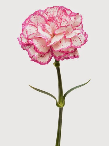
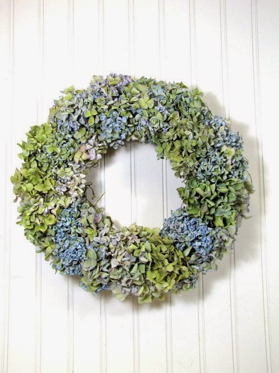
You will find all of these images within the promotional aspects along with the portfolio and the dissertation due to wanting those exquisite images present. all of the images are from pinterest.com and can be found when searching for 'flowers' 'flower designs' and 'unusual presentations of flowers'. I wanted to mention this within the blog because I did not want to be scrutinised for plagiarism so want to emphasise that non of the image through these are my own and I focused on using all of the image below for the hand in.