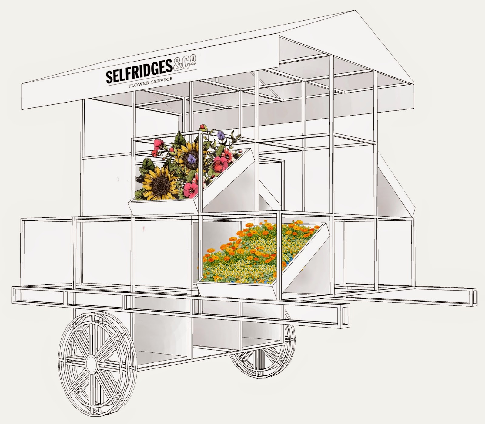
With the pop up stall being slightly trickier to draw out than the counter, this meant that it look Eunice a little longer to draw up with emails going back and forth to ensure that the right design was created. In time this was finalised and I met up with Eunice to get the final copies.
When getting the copies back I noticed that she had flattened the photoshop file which made it very difficult to allow further development to be made for the stall. This then left me in a position where I did not know what to do with myself not being very confident with Photoshop. I then took the file to my tutor and asked for this help/advise on what he recommends that I do with me layer.
This is then where he showed me how to select areas and create a new layer and copy and paste with this. This then allowed myself to then experiment with the overall design of the pop up stall. However, with this being so, I still did not want to do too much to the stall to show how this would look but I also wanted to show how flowers would be placed onto this. Due to this factor, I only added imagery to the plaques to show the best seller style that would come from the stall.
Here are two ideas that I had experimented with;
These image show how I tried to place in the same flower and different flowers. When looking at these to come to a decision the one that stood out to me most is the one with the different flowers with this being a realistic output seeing as they would not usually place the same flower together.
This then meant that the stall was finalised at it was time to start putting the board options into place.


No comments:
Post a Comment