Wednesday 30 April 2014

Final Board Outcome

This is the final outcome for the board. The reason why this has been positioned in such way is due to the importance of the service. This would introduced to the public through the existing selfridges website and then this would create a whole new site that would draw in custom this way. From this, social media platform would be used, this includes Facebook, twitter and instagram due to this being so popular. Extra forms of promotion for this would be flyers and mail outs that would target new customers. Lastly, the key promotion that would travel around the key cities in the UK is the pop up stall. With Selfridges only have 4 stores, this would target areas that the service would may not reach and would display to them what this service entails and how this plans to work.

This is why the board was laid out in such way. I am happy with the presentation of the board as it is not to busy and allows you to look through this and analyse all the sections. With another deadline being met, this means that a few days off will be required to allow my brain to think of new ideas. As the bank holiday is coming up too this means that not alot of work will be done but com monday, this is where I will start all the hard work again pushing for a hard 10 days left before it is all handed in.

Tuesday 29 April 2014

Promotion that will be going onto the board


The promotion that is being displayed within the page are the forms of promotion that I find best communicate what the service is about and how the brand of Selfridges would go about making this known to the public. This showcases many forms of promotion which will also consider the 5 it's. This stage is now complete and I am ready to progress by planning out the best way to showcase this.

Monday 28 April 2014

Week 15 Timelog

The past week has been a stressful week due to this being the build up of the hand in for the visual final board. This meant that all week I was preparing myself for this deadline making sure that all the finishing touches along with last minute changes and placements were correct.

Within the past week the elements of design that were carried out include;

  • pop up stall design
  • Layout ideas and development of chosen board
Although this seems like very little these were the final to aspects that needed to be completed and finalised to ensure that the outcomes were put into place. The colour technique and the placement is what took the longest. The positioning of each promotional method needed to be placed correctly to allow this to flow. 

Within the week during the 15, the board was complete and I also began planning and initiating what was going to come next in terms of development to allow myself to be ready and prepared for the final hand in deadline. This entailed listing all the promotion left so that I was organised and on track.

I could of probably done a little more during this week but once I had handed in I wanted to give myself some time off over the weekend and with this being bank holiday weekend coming up too I knew I wouldnt get much done so I had a break and relaxed putting my mind at rest ready for when I returned from home to a stressful 9/10 days of working hard for a good degree.


Artboard Layout

With the art board this needs to showcase all the key areas for the whole campaign to allow the audience to be able to come to some sort of analyse as to what it is you are trying to promote. This means that this needs to be clearly sectioned off and point out key areas that need that extra push.

The art board for the campaign is important as this is what the audience will be drawn to due to the scale in which this will be presented to them so this is a area that needs full attention and time spent within this.

Things to consider when laying out the board are;

  • outline the text
  • embed all images
  • check the spelling
  • ensure all work stays well within the margins
  • CMYK setting
  • no bigger than 150MB
  • Hierarchy is key
  • think about the 5 It's
  • What comes first within the campaign? link back to the campaign and media plans if needed
When considering all of these factors this will ensure that the right layout will have been chosen for the right reasons. With this being so, I am now going to go away and play about with the layout and see what I can come up with.

Sunday 27 April 2014

Development for the Pop up Stall

With the pop up stall being slightly trickier to draw out than the counter, this meant that it look Eunice a little longer to draw up with emails going back and forth to ensure that the right design was created. In time this was finalised and I met up with Eunice to get the final copies.

When getting the copies back I noticed that she had flattened the photoshop file which made it very difficult to allow further development to be made for the stall. This then left me in a position where I did not know what to do with myself not being very confident with Photoshop. I then took the file to my tutor and asked for this help/advise on what he recommends that I do with me layer.

This is then where he showed me how to select areas and create a new layer and copy and paste with this. This then allowed myself to then experiment with the overall design of the pop up stall. However, with this being so, I still did not want to do too much to the stall to show how this would look but I also wanted to show how flowers would be placed onto this. Due to this factor, I only added imagery to the plaques to show the best seller style that would come from the stall.

Here are two ideas that I had experimented with;


These image show how I tried to place in the same flower and different flowers. When looking at these to come to a decision the one that stood out to me most is the one with the different flowers with this being a realistic output seeing as they would not usually place the same flower together.
This then meant that the stall was finalised at it was time to start putting the board options into place.

Friday 25 April 2014

Further Promotion designs

With constant contact between myself and Eunice, I have been sent what the final products look like and I am really happy with the outcomes. It is now down to myself to add colour and the flower products to allow this to come to life and have further meaning and definition.

Here are the final outcomes;


With the outlines being completed and drawn up this now means the development stage is now down to myself. I will have to experiment from here and see what looks the best.

Monday 21 April 2014

Week 14 Timelog

During week 14 for myself there was not a lot done really due to trying to distinguish what stage was coming next. This week left me a little bit confused as to where to go in terms of direction and analysis as I wanted to try and form a structure before diving straight into the whole design process.

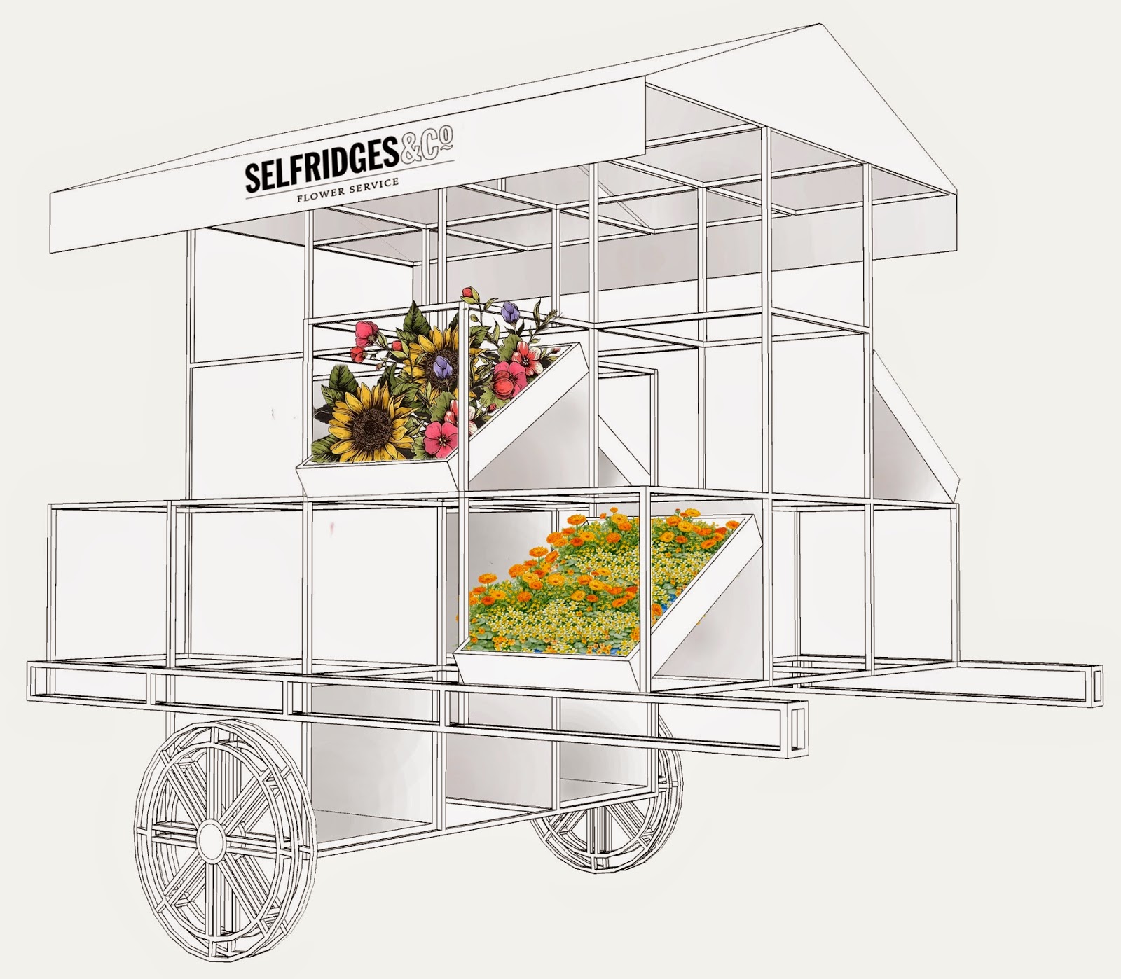
With the communication flowing between myself and Eunice, the graphic designer for my stall and counter this meant that images along with emails and opinions were flying about trying to come to some sort of final decision. During this week just gone, Eunice managed to complete the counter design for the pop up stall which meant that she sent me the final outcome for this. With myself being happy with the final outcome, she then informed myself that she was then going to make a start on the stall. This gave me a slight glimmer of hope due to the professional outcome she was showing me.

With this being finalised and nearly complete, this then allowed myself to look into colour direction for the stall. I want to try and fit it in with the colour scheme Selfridges already maintain so I will try and experiment with the likes of yellow, black, white and also hints of pink occasionally.

Within the next week, in terms of myself doing work there will be very minimal done as I am having a break from work and going to Amsterdam for a few nights to try and give my mind a break from work. This means that Eunice will draw up the stall for me and email me her progress so that when i return from the trip, i can edit these forms of promotion and design others for the final board. This will then leave me on top of all forms of promotion which will allow me to put these into place and position them how I want to also allowing me to focus on other forms of promotion that will be placed onto the table.
This next few weeks will focus on promotion and preparing for the final hand in along with the portfolio.

Monday 14 April 2014

Week 13 Timelog

Although I said I would have a week off from design elements, I still need to have some form of structure to keep onto of my time management so within the past few days I have spoke to my graphic designer Eunice Flaguel from the same university who is happy to draw my designs for me due to myself not having the same capabilities this means that I have been in touch, sent her further images and asked for her help if she is still willing to do so. With gathering a positive reply the contact between myself and Eunice has been constant and she is happy to help with the drawings and has made a start on these drawings. This has shown me that she is half way through the counter and is going to make a start on the stall. I am extremely happy to have her help and will credit this at a later stage.

I have also found further mock up designs that I would like to use but with this being the easter break and myself going on holiday to Amsterdam on Monday 21st this only leaves me a week so I am going to do as much as possible within this week and then try and leave myself enough time to try and place this all together onto the board template to showcase how I want this to look.

I am happy with what I have achieved within this week, I have relaxed yet also been in constant contact with a graph designer who has assured me she is happy to help with the drawing and from the images sent the quality is professional and would be realistic for the brand of Selfridges. With the deadline for all the visuals being the 1st May this only leaves me around 10 days so I need to get cracking and design what I can within the time scale and leave the rest for the portfolio work. This is what my intentions are for the next upcoming week before I jet off to Amsterdam.

Wednesday 9 April 2014

Submission Day

With going to a ASDA - George fashion talk in Leeds with a my tutor and a few other student on Thursday 10th at 8:30am this means that I would not be able to hand this in at all on the thursday as the trip does not end until 3:30pm and getting back from leeds means that the office would be shut.

With this being so, I have just handed my piece of work into the Fashion office a day early so that my tutor can go to the window and collect this and then mark it with the others that will be handed in on time on the thursday.

With handing this in, this is such a relief with this being 70% of the mark. However, I find that I am excited to get on with further visual designs over the next 2 weeks and add further definition to the project. However, with working non stop for the past weeks this means that I am going to give myself a good week off any design work and relax before carrying on with further promotion outcomes.

Tuesday 8 April 2014

Finishing Touches & Priniting

With all the finishing touches being made and the whole design being finished with the created promotional methods placed within the right areas this then allowed me to be able to get this printed on the day. With booking in for a block cover, this was literally ready and waiting and I only needed to print out my pages which gave me 2 days to check over for any mistakes and get a re-print if needs be.

With the design being complete I was extremely happy with the outcome, when using the blog page as a form of inspiration I believe this has been carried through in a professional and sophisticated manner allowing the service to be portrayed in a classical sense linking in with the authority that Selfridges beholds whilst also showcasing how this is a different expansion for the brand and is modern and bring the brand new life and release.

The Final outcome looks like this;


I stuck to the black and yellow colour scheme and added hints of pastel colours within the images to brighten this up. This is the final piece that will be handed in, in two days.